
Collections
Learn how to manage your card sets, edit your card collection and more.
Juan Delgado - May 13, 2020
Create and Edit Cards
For this tutorial we’ll create a very basic Blueprint and create some cards using it. Open Card Creator and follow these steps:
1) Create a new project

2) Add a new Card Set

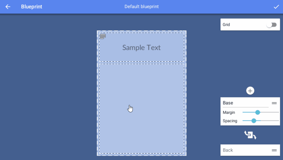
3) Create a new blueprint

4) Assign the bottom field as “Icon” type and save the blueprint. If you need more help creating blueprints you can check the guide Blueprint.
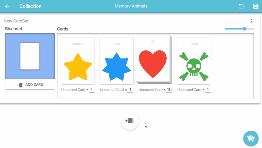
5) Add some cards using the “Add card” button.
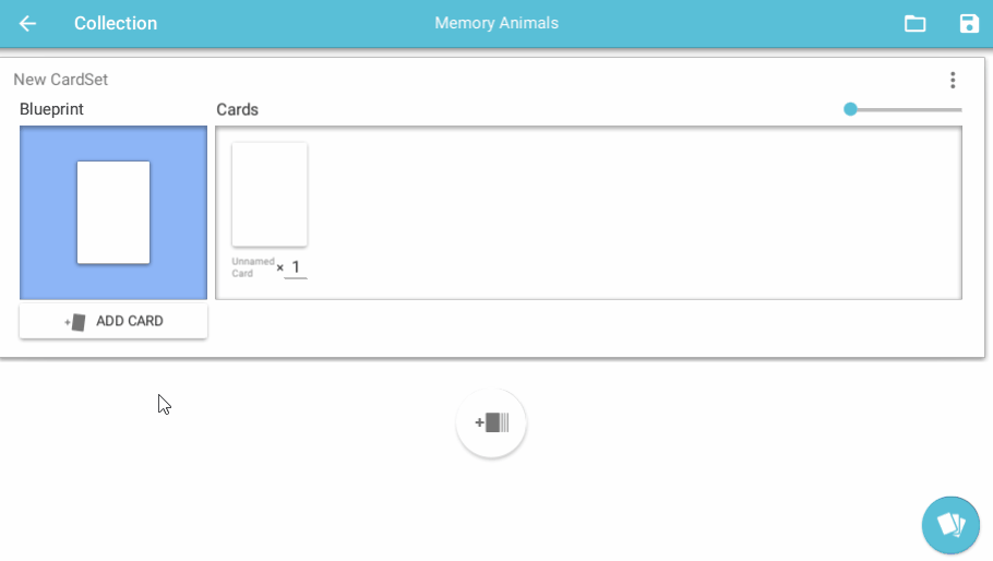
6) Click on a card and then on any of the fields to assign values.

7) Click on the “Save” button on the top right of the screen to save your project.

Extra tips
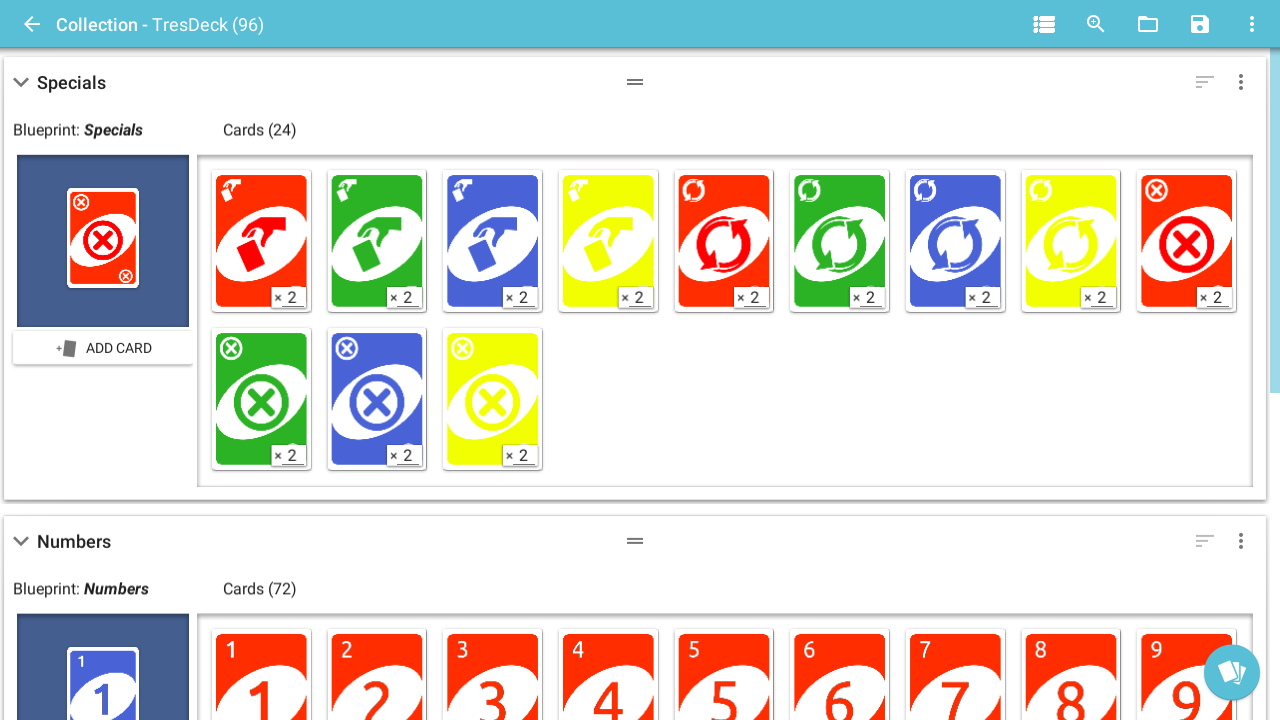
- You can specify the amount of each card you want using the input boxes below each card.
- You can reorder your cards via drag & drop.
- The save icon will be highlighted whenever you have unsaved changes.
- You can define and use custom variables and inline icons, see the video below
https://i.imgur.com/xyBXPfS.mp4
Card Panels
The card panels are the different sections of a card you can edit. You assign them on the blueprint editor with default values and then override these values as needed in the collection editor.
These are the currently available panel types:
Empty Panels
These are the default panels. They have no content or values and thus cannot be selected in the collection editor.
It is recommended to set as this type any panel you don’t plan to use in order to keep you design clean.
Text Panels
You can display formatted text with these panels. One of these panels can also be set as “Card Name” in the blueprint editor advanced options so its content is used as the card name on the collection editor.
These fields also support rich formating for effects like bold, italic, colors and more since version 2.3.
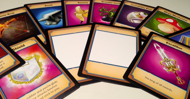
Image Panels
These panels are used to display images in JPG or PNG format. The URI field supports:
- Local paths, e.g: C:\MyImages\MyCardGame\Player.png
- Online URLs, e.g.: https://www.gstatic.com/webp/gallery3/1.sm.png
You can also tint you image using the tint field. Using this field without assigning an URI will result in a flat-coloured panel.
Try to keep your image sizes under a reasonable size. Big images will work but they’ll increase your loading and exporting times.
The mask URI field is optional, and allows for using an image as a mask. This feature is specially useful for oddly shaped frames (e.g: the image frames in HearthStone cards).
In the collection editor, click+dragging with the mouse over these fields allow you to position the image and the mouse wheel allows you to zoom in/out.
Icon Panels
These panels allow you to pick a flat icon from the included icon gallery and also set its main color and background color.
These are also very useful for using as placeholders if you don’t have any images for your game.
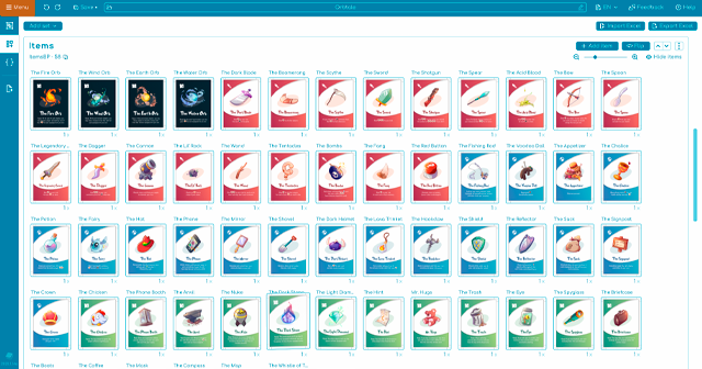
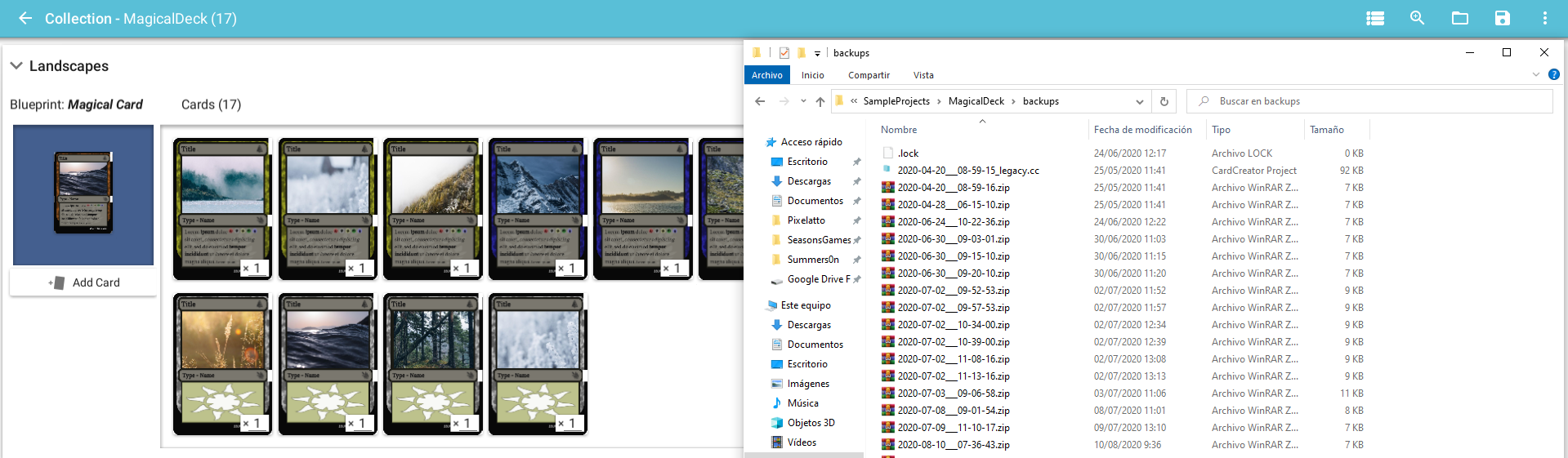
Create & Manage Card Sets
A Card Set is a group of cards in your collection sharing the same format or “blueprint”.
You can have different card sets sharing the same blueprint or use different ones on each set.
To create a new card set:
1) Create a new Card Set using the “Add Card Set” button
2) The “Assign blueprint” window will be displayed so you can assign a blueprint to you new card set.
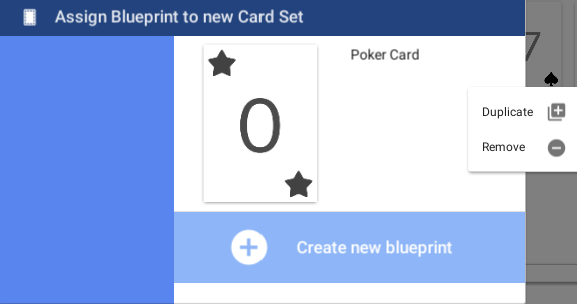
You have 3 ways of creating a blueprint from this screen:
A) Create a new blueprint from scratch for the new set by clicking on “create new blueprint”.
B) Link the new card set to an already existing blueprint by clicking on the blueprint you want to use.
C) Create a unlinked copy of an existing blueprint so you can modify it independently by right clicking on a blueprint and then on “duplicate”.
3) Your new Card Set is created! Depending on wich option did you use, you’ll be taken to the blueprint edit or collection screen. Either way, you’ll find your new card set back in the collection editor.
Extra tips
- You can rename your card sets by clicking on their name.
- You can reorder and remove Card Sets via the upper right dropdown menu on each card set.

